studio r—p
Famous Brand Redesigns: Reinventing Identity for Success
15 July
•
5 min.
SHARE ARTICLE

In the world of branding, evolution is inevitable. As companies grow and consumer preferences shift, even the most recognizable brands must adapt to stay relevant. A successful brand redesign goes beyond just a new logo—it’s about refining a company’s identity while maintaining the core essence that people know and trust. Let’s take a look at some of the most famous brand redesigns and what made them work.
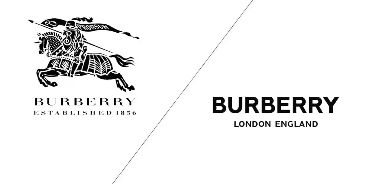
Burberry: Blending Heritage with Modernity
Burberry’s 2018 rebrand was a bold move for a legacy fashion house. The brand replaced its elegant serif logo with a clean, sans-serif typeface and introduced a bold new monogram pattern inspired by founder Thomas Burberry. This redesign aimed to modernize Burberry while staying true to its British luxury roots. The result? A fresh, contemporary aesthetic that resonated with younger audiences while maintaining its premium appeal.
Key Takeaway: A modern update doesn’t mean abandoning tradition—it’s about evolving in a way that aligns with your audience’s expectations.
Mastercard: Minimalism at Its Best
In 2016, Mastercard removed its wordmark from its logo, leaving only the iconic overlapping red and yellow circles. This shift to a symbol-only identity was a confident move, proving that a well-established brand can be recognized without words. By embracing simplicity, Mastercard reinforced its status as a globally trusted financial brand while optimizing its logo for the digital age.
Key Takeaway: Strong visual elements can make a brand instantly recognizable, even without text.
Instagram: From Skeuomorphic to Simplified
Instagram’s 2016 redesign sparked controversy, replacing its detailed camera icon with a vibrant gradient logo. While the shift was drastic, it aligned with the platform’s evolution from a photo-sharing app to a dynamic social network. Over time, users embraced the new look, which better reflected Instagram’s modern and youthful energy.
Key Takeaway: Sometimes, bold moves lead to initial backlash—but when a redesign aligns with a brand’s future vision, it pays off.
In the world of branding, evolution is inevitable. As companies grow and consumer preferences shift, even the most recognizable brands must adapt to stay relevant. A successful brand redesign goes beyond just a new logo—it’s about refining a company’s identity while maintaining the core essence that people know and trust. Let’s take a look at some of the most famous brand redesigns and what made them work.
Burberry: Blending Heritage with Modernity
Burberry’s 2018 rebrand was a bold move for a legacy fashion house. The brand replaced its elegant serif logo with a clean, sans-serif typeface and introduced a bold new monogram pattern inspired by founder Thomas Burberry. This redesign aimed to modernize Burberry while staying true to its British luxury roots. The result? A fresh, contemporary aesthetic that resonated with younger audiences while maintaining its premium appeal.
Key Takeaway: A modern update doesn’t mean abandoning tradition—it’s about evolving in a way that aligns with your audience’s expectations.
Mastercard: Minimalism at Its Best
In 2016, Mastercard removed its wordmark from its logo, leaving only the iconic overlapping red and yellow circles. This shift to a symbol-only identity was a confident move, proving that a well-established brand can be recognized without words. By embracing simplicity, Mastercard reinforced its status as a globally trusted financial brand while optimizing its logo for the digital age.
Key Takeaway: Strong visual elements can make a brand instantly recognizable, even without text.
Instagram: From Skeuomorphic to Simplified
Instagram’s 2016 redesign sparked controversy, replacing its detailed camera icon with a vibrant gradient logo. While the shift was drastic, it aligned with the platform’s evolution from a photo-sharing app to a dynamic social network. Over time, users embraced the new look, which better reflected Instagram’s modern and youthful energy.
Key Takeaway: Sometimes, bold moves lead to initial backlash—but when a redesign aligns with a brand’s future vision, it pays off.
Airbnb: More Than Just a Logo Change
Airbnb’s 2014 rebrand introduced the “Bélo” symbol, representing belonging, travel, and community. This redesign wasn’t just about aesthetics—it was a strategic move to reinforce Airbnb’s mission of creating a sense of home anywhere in the world. By shifting the focus from lodging to experiences and human connections, Airbnb solidified its position as more than just a rental service.
Key Takeaway: A successful rebrand tells a story and reinforces a company’s deeper mission.
Pepsi: A Nod to the Past with a Vision for the Future
In 2023, Pepsi unveiled a new logo that reintroduced the bold typography and striking contrast reminiscent of its 1980s branding. This redesign balanced nostalgia with a modern edge, showing that sometimes, looking back can be the key to moving forward. By embracing a design that felt both familiar and fresh, Pepsi reinvigorated its brand identity for a new generation.
Key Takeaway: The past can inspire the future—brands don’t always need to reinvent themselves completely to stay relevant.
The Secret to a Successful Redesign
A great brand redesign isn’t just about changing the logo—it’s about realigning with the company’s values, audience, and market position. The best redesigns:
Maintain brand recognition while feeling fresh and modern.
Reflect where the brand is headed, not just where it’s been.
Resonate with both loyal customers and new audiences.
Whether it’s a subtle refinement or a complete overhaul, a brand redesign has the power to breathe new life into a business. By understanding what works (and what doesn’t), companies can ensure their visual identity evolves in a way that strengthens their connection with customers for years to come.
studio r—p
other articles
More to read

Newsletter
Subscribe to our newsletter and stay in touch with us.
General Questions
Newsletter
Subscribe to our newsletter and stay in touch with us.
General Questions
Newsletter
Subscribe to our newsletter and stay in touch with us.
General Questions